Unlocking Healthcare Insights: Key Factors and KPIs for Analyzing Healthcare Systems with Power BI
Hello readers! Welcome back to ARTIFICALAB LTD! Today, we’re diving into an exciting topic in which how PowerBI is currently transforming the healthcare industry.
In an era where data is king, the ability to analyze and interpret vast amounts of information is crucial for improving patient care, optimizing operations, and making informed decisions.
In this below blog post, we will explore how Power BI is helping healthcare providers unlock valuable insights, enhance critical-time decision making, and ultimately shape the future of healthcare.
Whether you’re a healthcare professional, data enthusiast, or just curious about the impact of technology in healthcare, this blog post is for you. Now, let’s get started! 😊📊

"In the healthcare industry, every second counts. Fortunately, with the help of Microsoft Power BI, we can now develop Advanced Analytics Report Solutions that empower hospitals with real-time data insights, enabling swift and informed decision-making that can save lives and improve patient outcomes."
— Mr. Thu Ta Naing, Founder (ARTIFICALAB LTD), Professional Power BI Data Analyst, Sennior Consultant and Solutions Provider of PowerBI Projects
Why Healthcare Analytics Matter?
Before we explore about it, let's us understand for now who the Healthcare providers are really is?
In fact, they are actually organizations or individuals that deliver medical services to patients and that includes: Hospitals, Clinics, Primary Care Physicians, Specialist Doctors, Nursing Homes, Home Health Services, Hospice Care, Rehabilitation Centers, Mental Health Providers, Pharmacies etc.
Indeed, these providers have to work and coordinate together to ensure time-critical and comprehensive care for their patients, focusing on various health needs from preventive care to specialized treatments.
In fact according to sources, the current global healthcare industry is worth estimate USD 12 trillion dollars, and the United States alone was valued at around USD 808 billion, as of Year 2021.
Therefore, it is wise to explore about how this Superb Business Intelligence Software like PowerBI could empower it and revolutionize the way stakeholders analyze.
Moreover, Healthcare analytics involves the systematic use of data to drive decision-making and improve outcomes. By leveraging data, healthcare providers can enhance patient care, optimize operations, and reduce costs. The integration of analytics into healthcare systems allows for a more proactive approach, identifying trends and potential issues before they escalate.
Key Factors & KPIs to lookfor in Healthcare Power BI Projects
For now, I would assume you are still interested in looking for Healthcare Power BI Projects. In later section, I will reference some show case studies of a professional Power BI report on Hospital Analytics Power BI Solution.
For now, let's explore the key factors and KPIs that you should include in healthcare analytics project. These are important since healthcare providers need to understand and analyze so as to reflect and improve their operations and business.
Some of the key factors you should include in your Healthcare Analytics Power BI project include as follows:
1. Patient Satisfaction:
Why It Matters: Patient satisfaction is a critical indicator of the quality of care provided. High satisfaction levels often correlate with better patient outcomes and loyalty. Business Stakeholders of Healthcare Institutions will interest in this KPI so has to improve their business reputation!
KPIs to Track: Net Promoter Score (NPS), patient feedback scores, and average wait times etc. are some of the useful KPIs.
Operational Efficiency:
Why It Matters: Efficient operations ensure that resources are used optimally, reducing waste and improving service delivery.
KPIs to Track: Bed occupancy rates, average length of stay, and staff-to-patient ratios etc. These KPIs will be sought after by Operational Level including doctors, nurses, hospital staffs and patients.
Financial Performance:
Why It Matters: Financial health is crucial for the sustainability of healthcare organizations. Monitoring financial metrics helps in identifying cost-saving opportunities.
KPIs to Track: Revenue per patient, cost per procedure, and billing turnaround times etc., are some of the key KPIs in this factor. Investors, Owners of healthcare institutions and Financial Analysts will be interested in this.
Clinical Outcomes:
Why It Matters: Tracking clinical outcomes helps in assessing the effectiveness of treatments and interventions.
KPIs to Track: Readmission rates, infection rates, and treatment success rates. This is important so as to monitor the current situation of disease control and infection rate factors, as well as the treatment success.
Resource Utilization:
Why It Matters: Proper utilization of resources like staff, equipment, and facilities ensures that healthcare services are delivered efficiently.
KPIs to Track: Equipment utilization rates, staff productivity, and supply chain efficiency.
Referencing the ShowCase Project of Agile Insights' Healthcare Power BI Dashboard:
So, for our audience to get more in touch with real showcase, I have reference one good Power BI project on Hospital Analytics. The project is actually done by Agile Insights Company, which develops and provides Interactive Dashboards, Data Automation, Flexible Reporting, and Integrated Platform capabilities to their clients. In fact, if you want to become a Professional Data Analyst, you should study how this case study project is structured and analyze to give a perfect 360 view of Advanced Hospital Analytics to their clients.
Now, let's take a look. The Hospital Analytics Power BI Project is divided into 9 Sections as follows:
Section 1: HealthCare
In this first report section, the case study must include some of the key factors related to HealthCare Insights as follows:
Gender Diversity:
Understand the gender distribution of patients, which can help in tailoring gender-specific healthcare services.
Patients Admission Status:
Track the status of patient admissions (e.g., admitted, discharged) to manage hospital capacity and resources effectively.
Risk Level:
Identify patients’ risk levels to prioritize care and allocate resources to high-risk patients.
Patients by Time Period:
Analyze patient trends over quarters, months, and days to identify peak times and plan staffing and resources accordingly.
Patients by Location & Suburbs:
Determine where most patients come from, which can inform outreach and community health initiatives.
No. of Patients:
Overall patient volume.
Satisfaction Rate:
Patient satisfaction levels, indicating quality of care.
No. of Inpatients/Outpatients:
Breakdown of patient types for resource allocation.
Average Score:
Average health scores or treatment outcomes.
Treatment Costs:
Financial insights into treatment expenses, aiding in budget planning.
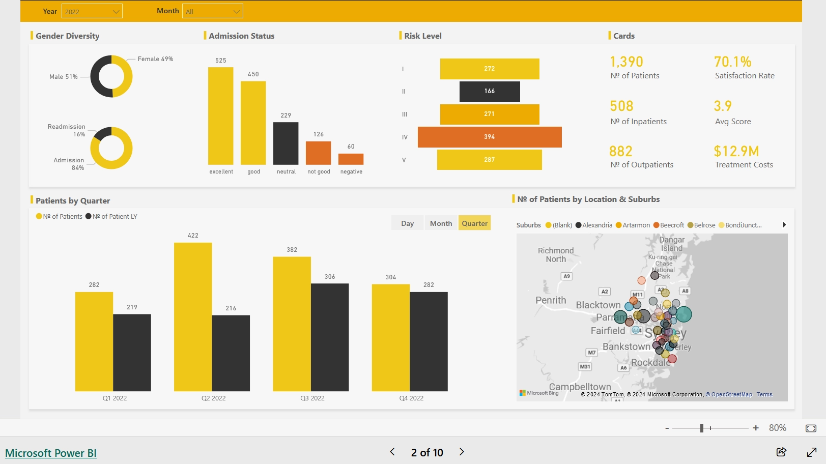
HealthCare Section: Image courtesy of Agile Insights
Section 2: Financial
Then, the second section should include about the Financial Performance of the Hospital, with various metrics to analyze. I have collected some good reference for you as shown in sample image by Agile Insights. Take a look, and explore some!
Actual vs Target values by Division:
Insight: This visual helps readers understand how each division (e.g., Oncology, Neurology, Dermatology, etc.) is performing against their targets. It highlights areas where divisions are meeting, exceeding, or falling short of their goals.
By comparing actual values to target values, stakeholders can identify which divisions need more resources or attention and which ones are performing well. This can guide strategic decisions and resource allocation.
Survey Scores & Treatment Costs:
Insight: This visual shows the relationship between patient satisfaction (survey scores) and the costs of treatments.
Higher treatment costs might correlate with higher or lower patient satisfaction. Understanding this relationship can help in evaluating the cost-effectiveness of treatments and improving patient care strategies.
Treatment Costs:
Insight: This visual provides a detailed view of the costs associated with different treatments.
By analyzing treatment costs, the hospital can identify expensive treatments and explore ways to optimize costs without compromising quality. It also helps in budgeting and financial planning.
Patients Admission & Average Treatment Cost, showing by Each Date:
Insight: This visual tracks the number of patient admissions and the average cost of treatments over time.
Trends in patient admissions and treatment costs can reveal patterns, such as peak admission times or rising treatment costs. This information is crucial for operational planning, staffing, and cost management.
Revenue & Expenses, showing by Each Date:
Insight: This visual compares the hospital’s revenue and expenses over time.
Understanding the financial health of the hospital by tracking revenue and expenses helps in making informed financial decisions. It can highlight periods of profitability or loss, aiding in financial strategy and sustainability planning.
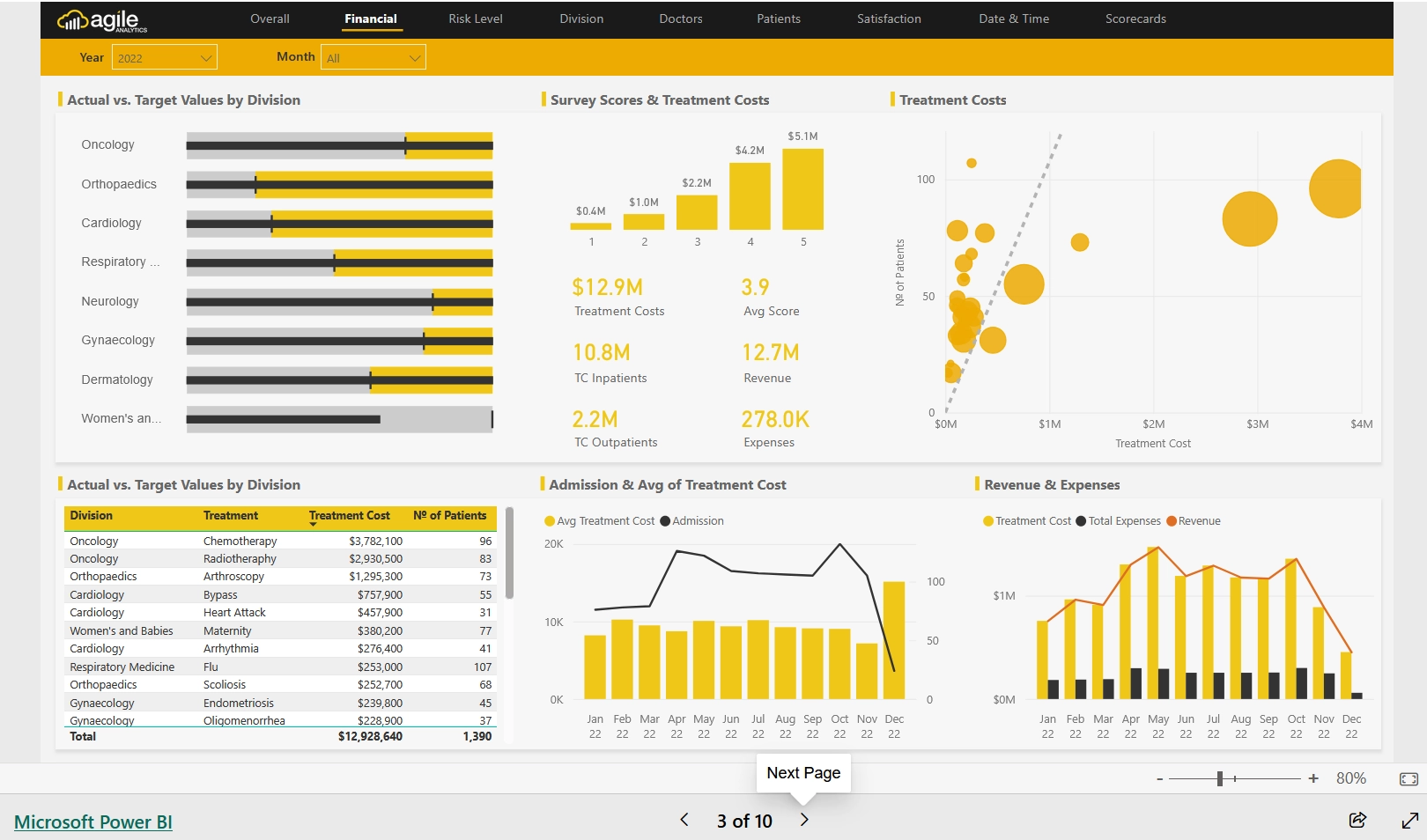
Financial Section: Image courtesy of Agile Insights
Section 3: Risk Level
Then, Risk Level analytics of the Hospital is analyzed. Several key issues need to consider include:
Risk Level & Patients Age Group (by each category range):
Insight: This visual helps identify which age groups are associated with higher or lower risk levels.
Understanding the distribution of risk levels across different age groups can aid in tailoring preventive measures and treatment plans for specific age demographics.
Risk Level & Treatment Types (such as Flu, Pneumonia, Maternity, Arthroscopy, etc.):
Insight: This visual shows the risk levels associated with various treatment types.
By analyzing risk levels for different treatments, the hospital can identify which treatments are more likely to involve higher risks and may require more intensive monitoring or resources.
Average Wait Time (min) by Risk Level: categorized by Inpatients and Outpatients:
Insight: This visual provides information on how wait times vary by risk level for both inpatients and outpatients.
Understanding wait times based on risk levels can help in optimizing patient flow and prioritizing care for higher-risk patients, improving overall efficiency and patient satisfaction.
Risk Level & Gender:
Insight: This visual highlights the distribution of risk levels across different genders.
Identifying any gender-specific trends in risk levels can help in developing targeted health interventions and ensuring equitable care for all patients.
Risk Level & Division:
Insight: This visual shows how risk levels are distributed across different hospital divisions.
By analyzing risk levels by division, the hospital can allocate resources more effectively and address any specific needs or challenges within each division.
Average Length of Stay (Days) by Risk Level:
Insight: This visual provides insights into how the length of hospital stay varies with different risk levels.
Understanding the correlation between risk levels and length of stay can help in planning and managing hospital capacity, as well as improving patient care strategies.
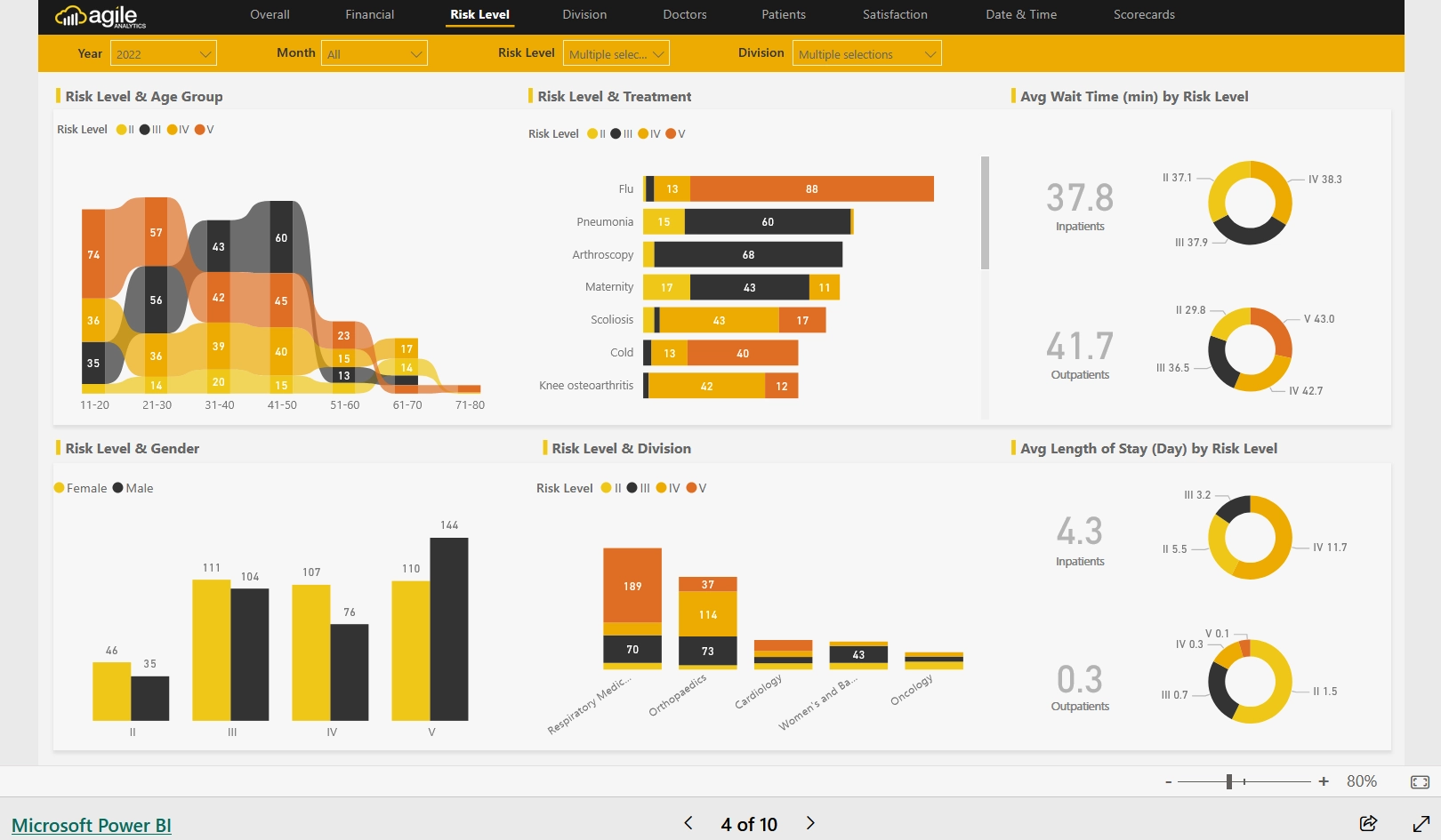
Risk Level Section: Image courtesy of Agile Insights
Section 4: Division
In this section, the Power BI Analytics Solution tends to display the insights related to each division of the Hospital such as Cardiology, Orthopedics etc.
Risk Level & Age Group, with Risk Levels by different divisions (Respiratory Medicine, Orthopedics, Oncology, Cardiology, Women’s and Babies):
Insight: This visual helps identify how risk levels vary across different age groups and divisions.
By understanding the distribution of risk levels among different age groups and divisions, the hospital can tailor interventions and allocate resources more effectively to address specific needs.
Wait Time Type & Type of Stay:
Insight: This visual shows the relationship between different types of wait times (e.g., emergency, elective) and types of stay (e.g., inpatient, outpatient).
Analyzing wait times by type of stay helps in identifying bottlenecks and improving patient flow, ensuring timely care for both inpatients and outpatients.
No: of Patients, Average LOS, and Treatment Costs:
Insight: This visual provides a comprehensive view of patient volume, average length of stay (LOS), and associated treatment costs.
Understanding these metrics together helps in evaluating hospital efficiency, cost management, and patient care quality. It can highlight areas where costs can be optimized and where patient care can be improved.
No: of Patients by Month:
Insight: This visual tracks the number of patients admitted each month.
Identifying monthly trends in patient admissions helps in planning for seasonal variations, staffing, and resource allocation, ensuring the hospital is prepared for fluctuations in patient volume.
Average Length of Stay:
Insight: This visual shows the average length of stay for patients.
Monitoring the average length of stay helps in assessing the efficiency of patient care and discharge processes. It can also indicate areas where patient care can be streamlined to reduce unnecessary prolonged stays.
No: of Patients by Risk Level (Risk Level I, II, III, IV, and V):
Insight: This visual categorizes the number of patients by different risk levels.
Understanding the distribution of patients across various risk levels helps in prioritizing care and resources for higher-risk patients, ensuring they receive the necessary attention and treatment.
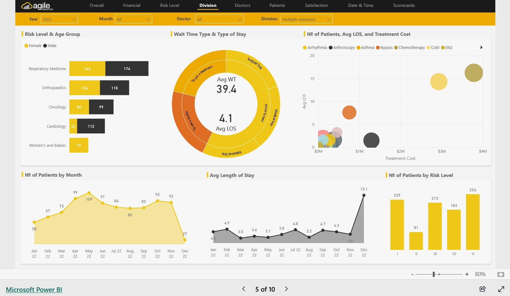
Division Section: Image courtesy of Agile Insights
Section 5: Doctors
In this section, the analytics project should include Patients analysis respective to each Doctor. Based on each Doctor as per selection, the patient analytics must be able to analyze! Some hints are as follows:
No: of Patients & Readmission Rate:
Insight: This visual shows the relationship between the number of patients and their readmission rates.
Understanding this relationship helps in identifying patterns or factors contributing to readmissions. It can guide efforts to improve patient care and reduce readmission rates, enhancing overall hospital performance.
Patients Satisfaction:
Insight: This visual provides an overview of patient satisfaction levels.
Monitoring patient satisfaction helps in assessing the quality of care and identifying areas for improvement. High satisfaction levels indicate good patient experiences, while lower levels highlight areas needing attention.
Treatment Types:
Insight: This visual categorizes the different types of treatments provided.
Analyzing treatment types helps in understanding the hospital’s service mix and identifying the most common or specialized treatments. This information can guide resource allocation and service development.
Treatment Cost, by each Date:
Insight: This visual tracks treatment costs over time.
Monitoring treatment costs by date helps in identifying trends and fluctuations in expenses. It aids in budgeting, financial planning, and cost management, ensuring the hospital remains financially sustainable.
Avg Wait time (min) by each Date:
Insight: This visual shows the average wait times for patients over time.
Understanding wait times helps in optimizing patient flow and reducing delays. It can highlight periods of high demand and help in planning staffing and resources to improve patient experience.
Age Range & Risk Level Diversity:
Insight: This visual provides a breakdown of patients’ age ranges and their associated risk levels.
Analyzing age range and risk level diversity helps in understanding the demographic and risk profile of the patient population. It can guide targeted interventions and resource allocation to address specific needs of different age groups and risk levels.
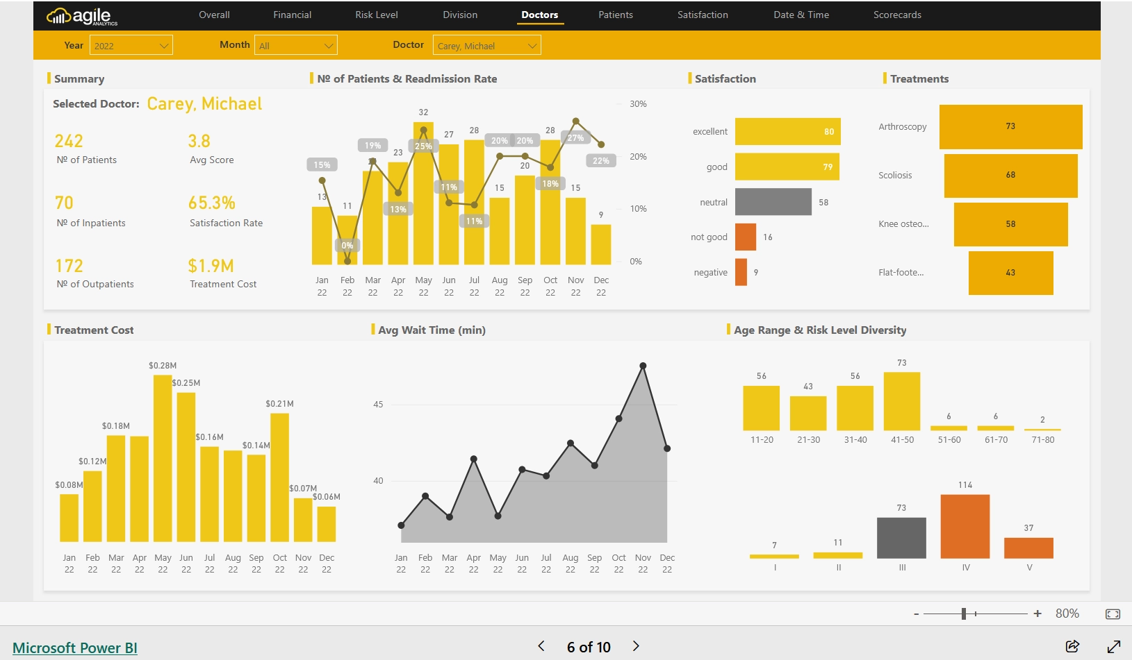
Doctors Section: Image courtesy of Agile Insights
Section 6: Patients
Patient Avg Waiting Time / Length of Stay:
Insight: This visual shows the average waiting time and length of stay for patients.
Understanding these metrics helps in assessing the efficiency of patient care and hospital operations. It can highlight areas where patient flow can be improved and where delays might be occurring.
Patient’s Details: Length of Stay and Treatment Cost:
Insight: This visual provides detailed information on the length of stay and associated treatment costs for individual patients.
Analyzing these details helps in understanding the cost implications of different lengths of stay and identifying opportunities to optimize both costs and patient care.
Type of Patients Stay & Payer (Medicare, Private insurance, Uninsured):
Insight: This visual categorizes patients by their type of stay (e.g., inpatient, outpatient) and their payer type.
Understanding the distribution of payer types helps in financial planning and identifying potential areas for improving billing and reimbursement processes. It also highlights the financial diversity of the patient population.
Risk Level:
Insight: This visual shows the distribution of patients across different risk levels.
Analyzing risk levels helps in prioritizing care and resources for higher-risk patients, ensuring they receive the necessary attention and treatment. It also aids in risk management and planning.
No: of Patients & Treatment Cost:
Insight: This visual provides a comparison between the number of patients and the associated treatment costs.
Understanding this relationship helps in evaluating the cost-effectiveness of treatments and identifying trends in patient volume and expenses. It can guide budgeting and resource allocation.
Age Diversity:
Insight: This visual shows the age distribution of the patient population.
Analyzing age diversity helps in understanding the demographic profile of patients and tailoring services to meet the needs of different age groups. It can also guide targeted health interventions and resource planning.
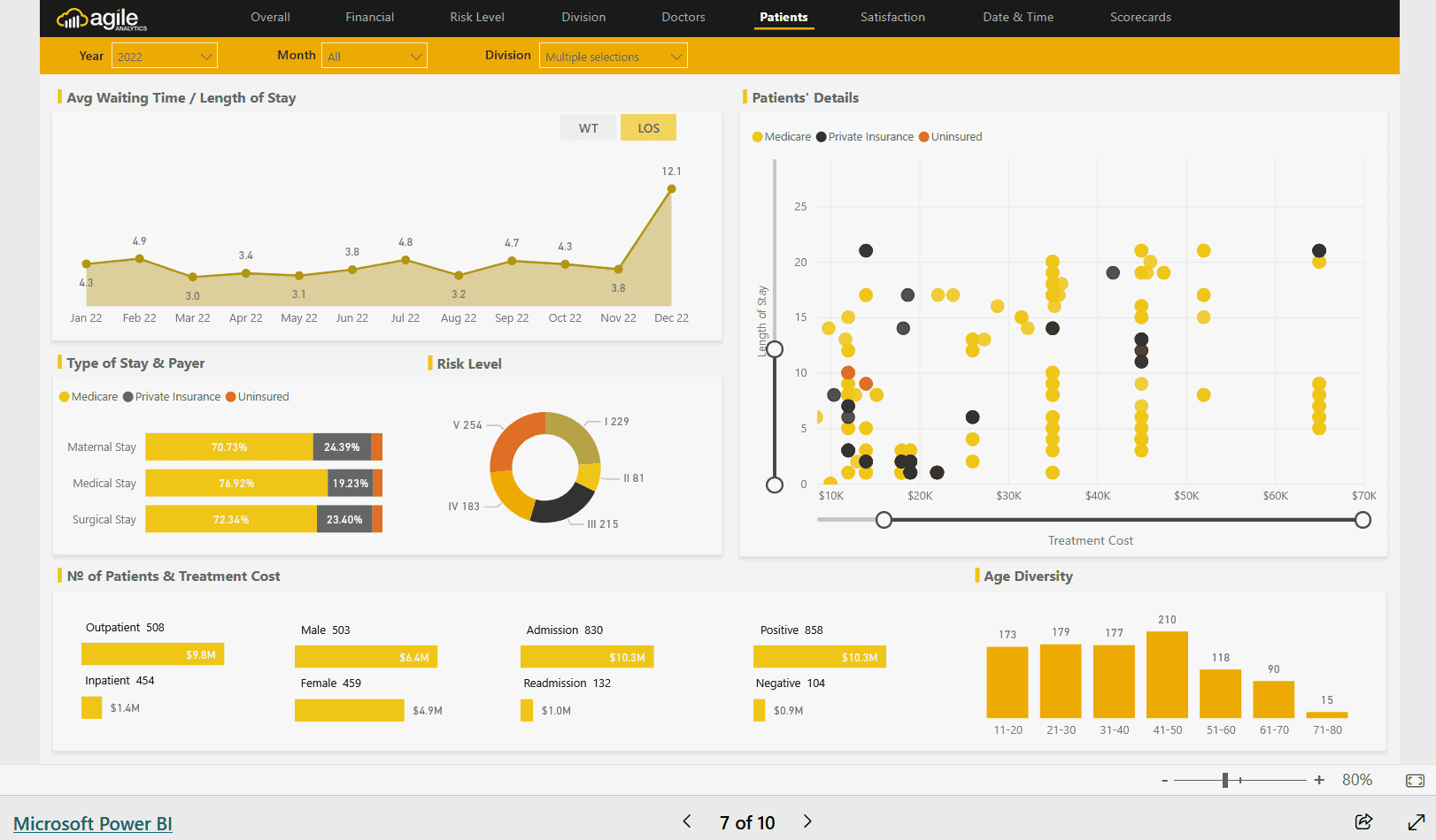
Patients Section: Image courtesy of Agile Insights
Section 7: Satisfaction
This section will include patients' satisfaction analysis in details.
Patients’ Satisfaction: from excellent to negative:
Insight: This visual provides an overall view of patient satisfaction levels, ranging from excellent to negative.
Understanding the distribution of satisfaction levels helps in assessing the general patient experience and identifying areas needing improvement. It highlights the hospital’s strengths and weaknesses in patient care.
Satisfaction for Top 5 Divisions (Respiratory, Oncology, Neurology, etc.):
Insight: This visual shows patient satisfaction levels specifically for the top five divisions.
Analyzing satisfaction by division helps in pinpointing which departments are performing well and which may require attention. It can guide targeted improvements and resource allocation to enhance patient care in specific areas.
Satisfaction by Age Group:
Insight: This visual breaks down patient satisfaction levels by different age groups.
Understanding satisfaction across age groups helps in tailoring services to meet the needs of different demographics. It can reveal age-specific trends and guide interventions to improve satisfaction for all age groups.
Satisfaction by Nurse:
Insight: This visual provides insights into patient satisfaction levels associated with different nurses.
Analyzing satisfaction by nurse helps in identifying high-performing staff and those who may need additional support or training. It can also highlight best practices and areas for professional development.
Satisfaction through Time:
Insight: This visual tracks patient satisfaction levels over time.
Monitoring satisfaction trends over time helps in assessing the impact of changes or interventions on patient experience. It can highlight periods of improvement or decline, guiding continuous quality improvement efforts.
Survey Questions:
Insight: This visual shows the responses to specific survey questions.
Analyzing survey question responses provides detailed insights into specific aspects of patient care and experience. It helps in understanding patient concerns and preferences, guiding targeted improvements based on direct feedback.
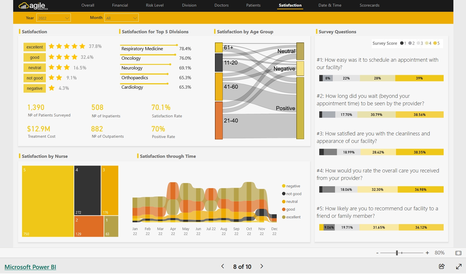
Satisfaction Section: Image courtesy of Agile Insights
Section 8: Date & Time
In this section, readers of this Case Study will find the ability to analyze Patients Metrics on Year, Month and Day accordingly.
No: of Patients, Treatment Cost, Average Wait Time by Analyzing with Year, Month, and Each Date:
Insight: This visual provides a comprehensive analysis of patient volume, treatment costs, and average wait times over different time periods (year, month, and each date).
By breaking down these metrics over time, readers can identify trends and patterns. For example, they can see if there are certain times of the year or specific dates when patient volume spikes, treatment costs increase, or wait times are longer. This information is crucial for operational planning, resource allocation, and improving patient care efficiency.
With 3 different categories of Patients: Positive, Neutral, and Negative:
Insight: This visual categorizes patients based on their overall experience or satisfaction (positive, neutral, and negative).
Analyzing patient metrics by satisfaction categories helps in understanding the impact of patient experience on hospital operations. For instance, it can reveal if patients with negative experiences tend to have longer wait times or higher treatment costs. This insight can guide targeted improvements to enhance patient satisfaction and overall hospital performance.
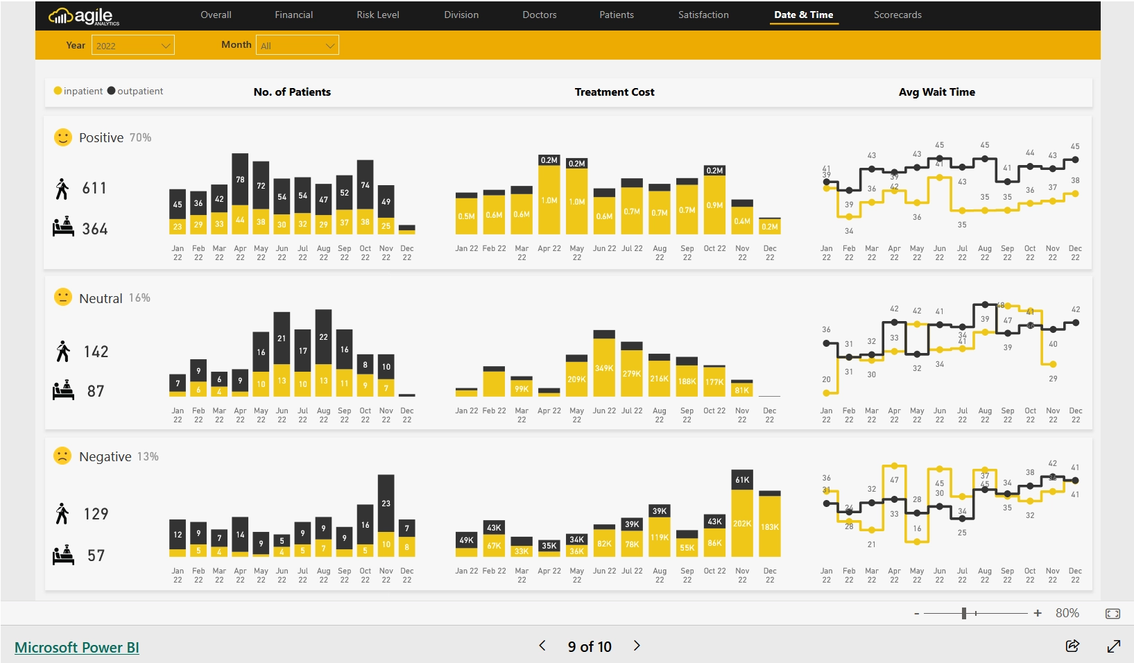
Date&Time Section: Image courtesy of Agile Insights
Section 9: Score Cards
In this final section of this case study, this will include the KPI Tracking on each factors as shown below, driven by Score Cards Visuals.
Score Card Visuals on Financial Performance:
Net Position:
Insight: This visual shows the hospital’s financial health by displaying the net position, which is the difference between total assets and total liabilities.
Understanding the net position helps in assessing the hospital’s financial stability and sustainability. It indicates whether the hospital is in a surplus or deficit, guiding financial planning and decision-making.
Score Card Visuals on Workforce Performance:
Employee Movement:
Insight: This visual tracks changes in the workforce, such as new hires, terminations, and transfers.
Monitoring employee movement helps in understanding workforce dynamics and planning for staffing needs. It can highlight trends in employee retention and turnover, guiding HR strategies.
Leave Liability:
Insight: This visual shows the accumulated leave liabilities, representing the financial obligation for employee leave entitlements.
Understanding leave liability helps in financial planning and ensuring the hospital can meet its obligations. It also highlights the need for managing leave balances effectively.
Overtime:
Insight: This visual tracks the amount of overtime worked by employees.
Monitoring overtime helps in assessing workload distribution and identifying potential issues with staffing levels. It can guide decisions on hiring or redistributing tasks to manage employee workload and prevent burnout.
Sick Leave:
Insight: This visual shows the amount of sick leave taken by employees.
Analyzing sick leave patterns helps in understanding employee health and well-being. It can highlight areas where additional support or interventions may be needed to reduce absenteeism and improve overall workforce health.
KPI Tracking Status on each:
Insight: This visual provides the status of key performance indicators (KPIs) for each subcategory.
Tracking KPIs helps in monitoring performance against set targets. It provides a quick overview of areas performing well and those needing attention, guiding strategic planning and continuous improvement efforts.
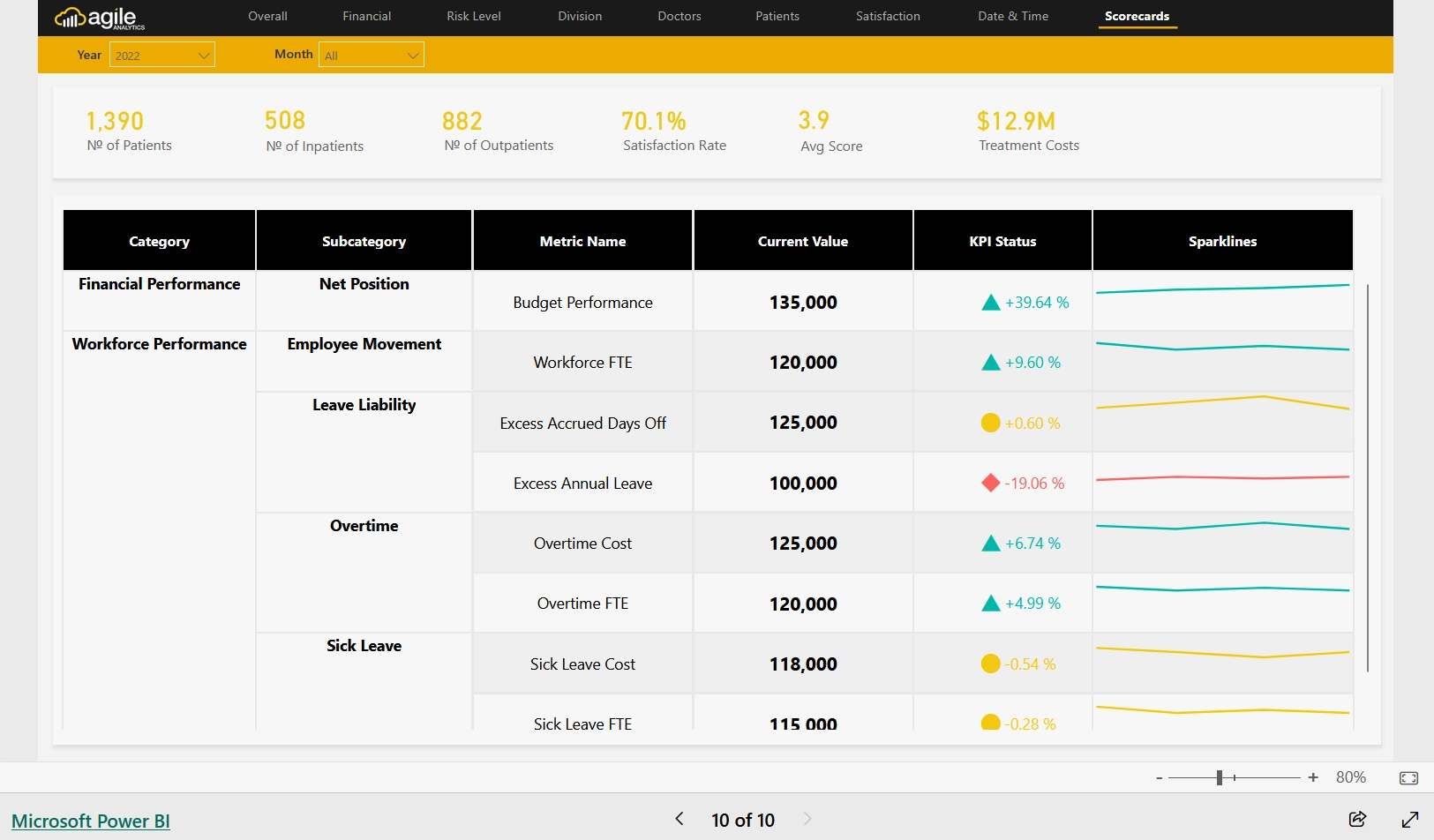
Score Cards Section: Image courtesy of Agile Insights
CONCLUSION
Thank you for taking the time to read this blog post on our Health Care Analytics Case Study. We hope it has provided you with valuable insights and sparked some great ideas for your own projects. Unlocking the full potential of healthcare data with Power BI not only drives better patient outcomes but also ensures the financial and operational health of healthcare organizations.
Also, if you’re looking to harness the power of data analytics in healthcare, consider joining our Power BI courses. Our expert-led training will equip you with the skills needed to create impactful healthcare dashboards and reports.
Ready to transform your healthcare analytics? Join our Power BI courses today on Udemy Platform! See you there!!


