AI Meets BI: Enhancing Power BI Dashboards with Intelligent Visuals
Welcome back from ARTIFICALAB LTD! Today, we will showcase some of the awesome Artificial Intelligence Visuals in Power BI that will enhance your productivity at work and help you demonstrate your expertise to potential employers. Well, the good news is that these AI-powered Power BI visuals will definitely make your reports more insightful and impactful. So grab a coffee, sit back & relax, and let's get started!
Key AI (Artificial Intelligence) Visuals in Power BI
Introduction to Artificial Intelligence
Before we start, it would be wise to know how we understood the term "Artificial Intelligence" as well as the role of AI in Power BI Platform. Well, Microsoft has released that Artificial Intelligence (AI) in Power BI includes the integration of advanced machine learning and AI capabilities within the Power BI platform. Apparently, this help users analyze data more effectively, uncover insights, and make data-driven decisions with greater ease.
In Simple Terms, it makes our work more easier, less complex, and more productive.
Why the Power of Artificial Intelligence in Power BI will help you as a Professional Data Analyst
Some of my clients asked me what are the major benefits we (data analysts) will get from this AI and Machine Learning integration in Power BI. Will it make better or will it make worse?
Well, apparently, I personally believed there are definitely key benefits as follows:
-
Enhanced Data Analysis: Quickly Analyze large datasets, identify trends & patterns.
-
Automated Insights: Generating Insights and summaries, quickly with minimum time & effort.
-
Improved Decision-Making: Finding you instant results based on the analysis of AI Model
-
Anomaly Detection: Detecting abnormal events, and alert to the Power BI Report Users
-
User-Friendly Experience: Making it more easier to navigate, analyze and interpret your data.
Ok, now you've understood the benefits of AI Visuals so let's explore each, one by one as below!
1. Key Influencers Visual in Power BI
The very first AI Visual that any Professional Power BI Data Analyst must know is this Key Influencers Visual. Before the development of AI, you as a data analyst might have to manually find the root-cause which factors are influencing on the metrics you want to discover.
However, this visual changes the way you solve your daily data analysis problems.
This Key Influencers Visual helps you understand the factors that influence a particular metric. It identifies key drivers and their impact on your data.
For example, if you’re analyzing sales data, the Key Influencers visual can show you which factors (e.g., discount rates, marketing spend) most significantly affect sales performance.
Please check below, to see a grasp of Key Influencers AI Visual in Power BI!
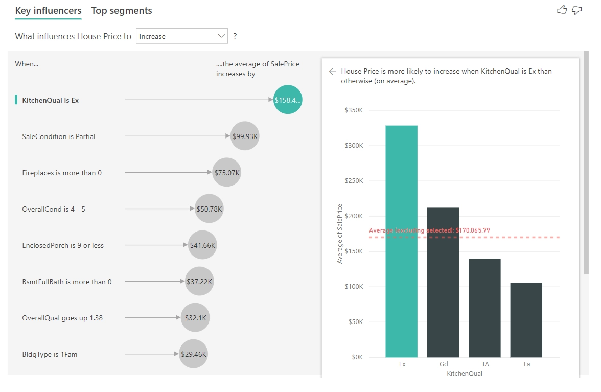
Key Influencers Chart: Image courtesy of Microsoft Inc:
2. Decomposition Tree Visual in Power BI
The next visual you need to learn is the Decomposition Tree Visual that utilizes the technology of AI. In short, it help users identify the most significant factors influencing a particular metric. If you check this visual, you will be convinced that the decomposition tree visual uses a hierarchical structure to display data, allowing users to explore different levels of detail. Moreover, this visual is particularly useful for understanding complex data relationships and identifying key drivers behind specific outcomes.
Some of the possible scenarios of this visual, I have listed as below:
-
Root Cause Analysis: Identifying the underlying causes of a problem or anomaly.
-
Performance Analysis: Breaking down performance metrics to understand contributing factors.
-
Data Exploration: Exploring data hierarchies and relationships in an interactive manner.
-
Decision Support: Providing insights to support data-driven decision-making.
Well, then you now have a general idea of possible scenarios this visual could be used. Now let's explore the real use-cases of this Decomposition Tree Visual in Power BI.
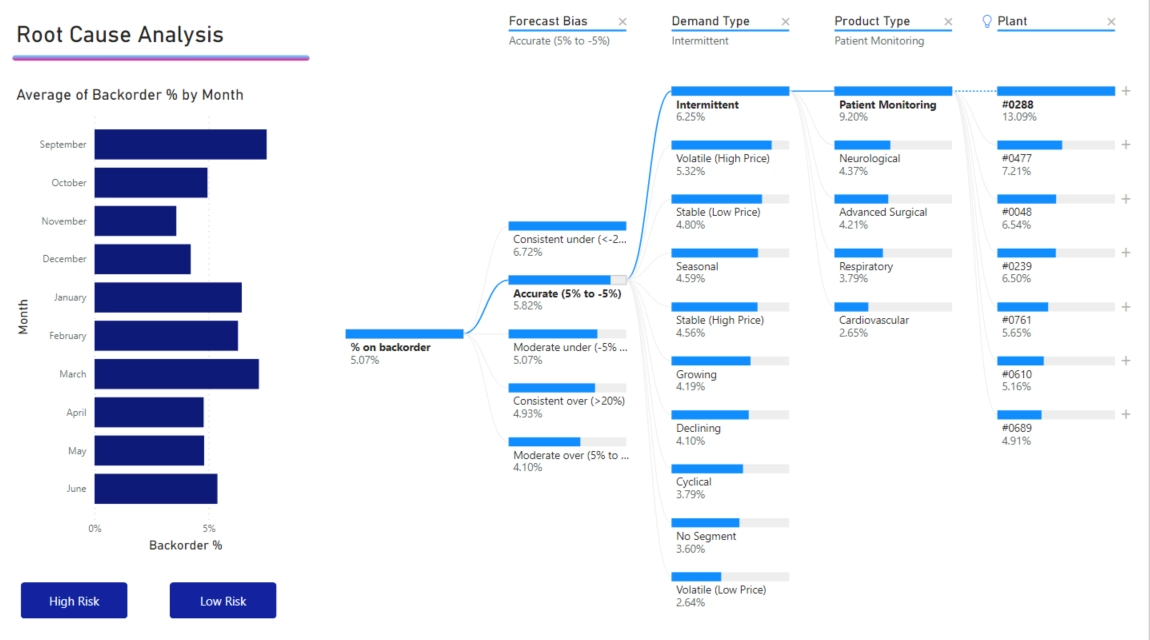
Decomposition Tree Chart: Image courtesy of Microsoft Inc:
Example 1: Supply Chain Analysis:
Scenario: Let's say a company wants to analyze the percentage of products on backorder.
Example 2: Sales Performance:
Scenario: Another example is suppose that a video game company wants to understand the factors driving sales.
Example 3: Customer Support:
Scenario: A tech company wants to analyze customer support ticket resolution times.
Application: The Decomposition Tree can break down resolution times by support agent, issue type, and priority level, helping the company identify areas for improvement.
Example 4: Financial Analysis:
Scenario: A tech company wants to analyze customer support ticket resolution times.
Application: The Decomposition Tree can break down resolution times by support agent, issue type, and priority level, helping the company identify areas for improvement.
Example 5: Marketing Campaigns:
Scenario: A marketing team wants to analyze the effectiveness of different campaigns.
Application: The Decomposition Tree can break down campaign performance by channel, target audience, and geographic location, helping the team optimize future campaigns.
3. Q&A Visual in Power BI
The third AI Visual popular among the Power BI Data Analysts is the Q&A Visual, by Microsoft. Indeed, as the name goes, Q&A stands for Questions & Answers, such that this AI-powered feature will allow users to ask natural language questions about their data and receive answers in the form of visuals. Keep in mind that this tool leverages machine learning to interpret user queries and generate relevant charts, graphs, or tables based on the data available.
Here are some of the possible scenarios for this Q&A visual:
-
Ad Hoc Data Exploration: Quickly exploring data without needing to create complex queries or visuals manually.
-
Interactive Dashboards: Enhancing dashboards with interactive elements that allow users to ask questions and get instant answers.
-
Business Reporting: Providing business users with an easy way to get insights from their data without relying on data analysts or IT support.
-
Training and Presentations: Demonstrating data insights in real-time during training sessions or presentations.
Well, then let's explore real use-case stories as below:
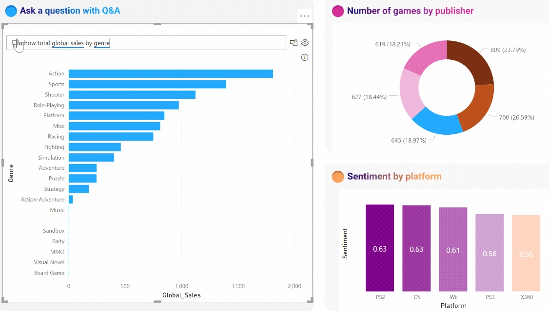
Q&A Visual: Image courtesy of Microsoft Inc:
Example 1: Retail Sales Analysis:
Scenario: A retail manager wants to understand the sales performance of different product categories.
Application: Using the Q&A visual, the manager can ask, “What were the sales for each product category last month?” and instantly get a bar chart showing the sales figures for each category.
Example 2: Customer Support Metrics:
Scenario: A customer support team leader needs to analyze the average resolution time for support tickets.
Application: The team leader can ask, “What was the average resolution time for support tickets last week?” and the Q&A visual will generate a line chart showing the resolution times.
Example 3: Marketing Campaign Performance:
Scenario: A marketing analyst wants to evaluate the effectiveness of recent campaigns.
Application: By asking, “How many leads were generated by each campaign?” the Q&A visual can provide a pie chart displaying the number of leads per campaign.
Example 4: Financial Reporting:
Scenario: A financial analyst needs to review quarterly revenue figures.
Application: The analyst can type, “Show me the revenue for the last four quarters,” and the Q&A visual will create a column chart with the requested data.
Example 5: Human Resources Insights:
Scenario: An HR manager wants to analyze employee turnover rates.
Application: The manager can ask, “What was the employee turnover rate by department?” and the Q&A visual will generate a table or chart showing the turnover rates for each department.
4. Smart Narrative Visual in Power BI
The fourth visual you should try is the Smart Narrative. This visual is called Smart because of its innovative features included in that visual. That is, NLP (Natural Language Processing) and Machine Learning Algorithms are utilized to analyze the data in Power BI based on user's inputs and intentions.
One of the key takeaways is that Power BI Report users could quickly understand the main key points, and takeaways from the original datasets, without having to analyze each and every visual to manually write summaries. In fact, it's a very very cool feature, and you should explore it! (Anyway, if you wanna explore this type of Innnovative AI Visuals, you can enroll our PowerBI Comprehensive Courses on Udemy, where we teach the various concepts of Power BI and prepare for PL-300 exam as well!)
So, then the next question is what scenarios this type of visual would fit in?
I would list them as follows:
-
Business Reporting: Providing quick summaries of key metrics and trends in business reports.
-
Data Presentations: Enhancing presentations with automatically generated insights that can be easily understood by the audience.
-
Dashboard Summaries: Adding textual explanations to dashboards to help users quickly grasp the main points.
-
Performance Reviews: Summarizing performance data for easy review and decision-making.
-
Training and Education: Helping learners understand data analysis concepts through automatically generated narratives.
However, you might want to explore the actual use-case stories, so you will better get an idea to use in your reports. Here are some use-case stories:
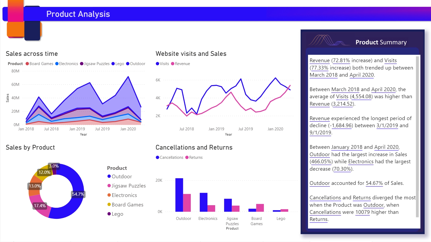
Smart Narrative Visual: Image courtesy of Microsoft Inc:
Example 1: Sales Performance Review:
Scenario: A sales manager needs to present the quarterly sales performance to the executive team.
Application: Using the Smart Narrative visual, the manager can generate a summary that highlights key sales trends, top-performing products, and regions with the highest sales growth. This summary can be included in the presentation to provide a quick overview of the sales performance.
Example 2: Marketing Campaign Analysis:
Scenario: A marketing analyst wants to evaluate the effectiveness of recent marketing campaigns.
Application: The Smart Narrative visual can generate a summary that explains the impact of different campaigns on lead generation, conversion rates, and overall ROI. This helps the analyst quickly identify which campaigns were most successful and why.
Example 3: Financial Reporting Analysis:
Scenario: A financial analyst needs to prepare a monthly financial report for the CFO.
Application: The Smart Narrative visual can summarize key financial metrics such as revenue, expenses, and profit margins, providing a clear and concise overview of the company’s financial health.
Example 4: Customer Support Metrics:
Scenario: A customer support manager wants to review the team’s performance metrics.
Application: The Smart Narrative visual can generate a summary that highlights average resolution times, customer satisfaction scores, and the most common issues reported by customers. This helps the manager quickly understand the team’s performance and identify areas for improvement.
Example 5: Project Management:
Scenario: A project manager needs to report on the progress of a project to stakeholders.
Application: The Smart Narrative visual can summarize key project metrics such as completion percentage, budget utilization, and milestone achievements. This provides stakeholders with a clear understanding of the project’s status.
5. Anomaly Detection Visual in Power BI
The final AI Visual you should explore when learning Power BI is about Anomaly Detection visual. As an experienced Power BI Data Analyst, I have seen numerous cases in Power BI Reports such that stakeholders want to analyze the abnormal and unusual possible situations, and be able to analyze and detect as soon as possible.
I believed that this visual will solve this kind of problems since it is an AI-powered feature that enhances line charts by automatically detecting anomalies in time series data.
With the AI Machine Learning Techniques, the Power BI AI Model learns and identify the data points that could possibly deviate significantly from the expected range. Then it will provides explanations for these anomalies, so that Power BI report users can conduct root cause analysis easily.
Again, what are the possible scenarios of this Anomaly Detection Visual?
Well, there are very important time-critical scenarios that will play out with this visual. I will list here most common scenarios:
-
Time Series Analysis: Monitoring trends and identifying unexpected changes in data over time.
-
Quality Control: Detecting anomalies in manufacturing processes to ensure product quality.
-
Financial Analysis: Identifying unusual transactions or financial performance metrics.
-
Operational Monitoring: Monitoring system performance and detecting irregularities in real-time data.
-
Customer Behavior Analysis: Spotting unusual patterns in customer behavior or sales data.
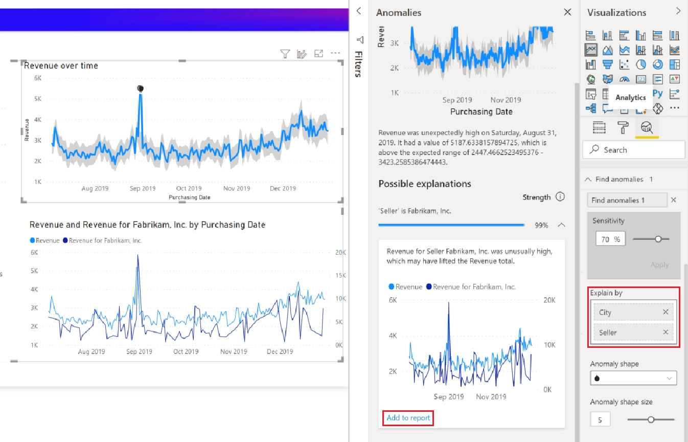
Anomaly Detection Visual: Image courtesy of Microsoft Inc:
Example 1: Retail Sales Monitoring:
Scenario: A retail chain wants to monitor daily sales to identify any unusual spikes or drops.
Application: Using the Anomaly Detection visual, the company can detect days with significantly higher or lower sales than expected. For example, a sudden drop in sales might indicate an issue with inventory or a problem with the point-of-sale system.
Example 2: Manufacturing Quality Control:
Scenario: A manufacturing company needs to ensure the quality of its products by monitoring production metrics.
Application: The Anomaly Detection visual can identify anomalies in production data, such as unexpected variations in temperature or pressure, which could indicate potential defects in the manufacturing process.
Example 3: Financial Fraud Detection:
Scenario: A financial institution wants to detect fraudulent transactions in real-time.
Application: By applying the Anomaly Detection visual to transaction data, the institution can identify transactions that deviate significantly from normal patterns, helping to detect and prevent fraud.
Example 4: Website Traffic Analysis:
Scenario: A digital marketing team wants to monitor website traffic to identify unusual patterns.
Application: The Anomaly Detection visual can highlight days with unusually high or low traffic, allowing the team to investigate potential causes, such as successful marketing campaigns or technical issues.
Example 5: Energy Consumption Monitoring:
Scenario: An energy company needs to monitor electricity usage to detect irregularities.
Application: The Anomaly Detection visual can identify days with unexpected spikes or drops in energy consumption, helping the company investigate potential issues such as equipment malfunctions or unauthorized usage.
CONCLUSION
Thank you for joining us on this journey through AI Meets BI: Enhancing Power BI Dashboards with Intelligent Visuals. We hope this blog post has provided you with valuable insights into the most popular AI visuals in Power BI, including their applications and real-world use cases. These powerful tools can significantly enhance your data analysis capabilities, making your reports more insightful and impactful.
Also, thank you for reading this blog post. We hope you enjoyed it and gained additional knowledge about the incredible AI features in Power BI. If you want to explore more, please check out our Power BI Comprehensive Courses on Udemy, where we offer various courses designed to suit your needs! Happy learning! 😊

